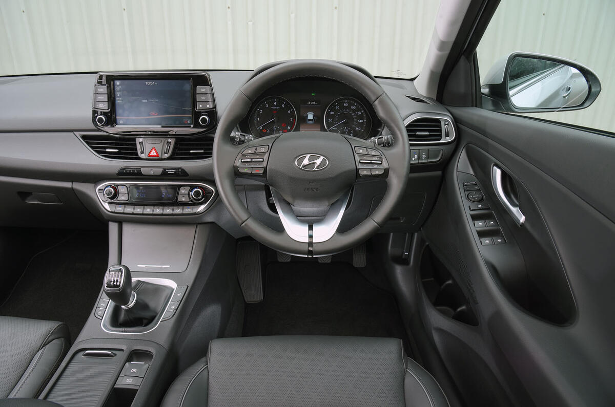
Perhaps even more so than the exterior, the i30’s interior has been comprehensively rethought.
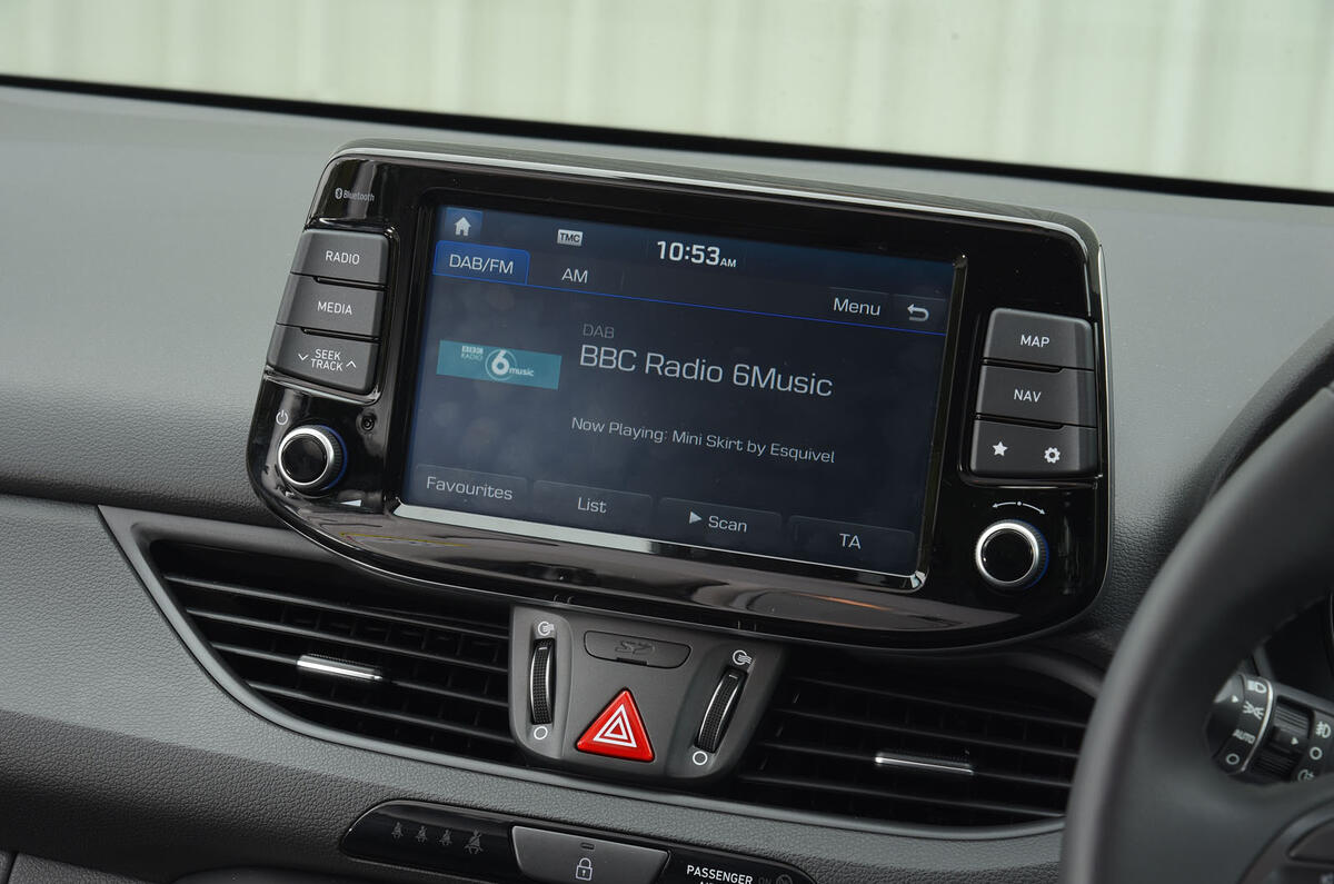
The changes are wholesale, although the most notable alteration is also the most contentious: Hyundai has opted to extract the infotainment screen from its integrated position in the centre stack and plonk it on top.
The advantage of doing so is that it permits a liberal shrinking of the dashboard, thereby enhancing the perception of light and space, yet Hyundai also remains wedded to the use of physical shortcut keys, which are functionally useful but make the new stand-alone display a little unsightly to behold. As disagreeable as the i30’s 8.0in touchscreen is to behold, there’s precious little that’s fundamentally wrong with what appears on it.
The shortcut keys are well chosen — splitting Map and Nav is a wise choice — and the system sensibly retains old-fashioned knobs for the volume and zoom functions.
Doubtless, a Volkswagen Group engineer would point out that Hyundai has preserved such outmoded features because the technology behind the system isn’t fast or glossy enough to make everything happen on screen — and compared with the lustrous sheen coming from the new Volkswagen Golf’s infotainment, the accusation wouldn’t be entirely unfounded.


