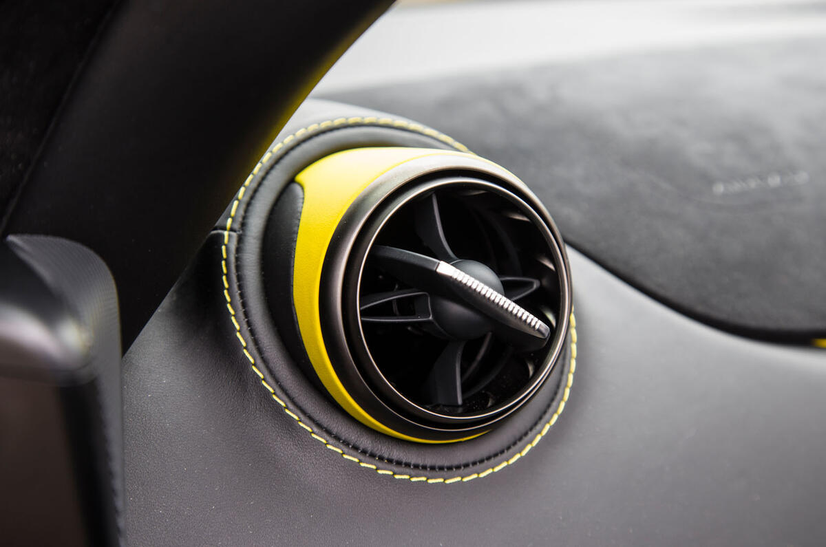
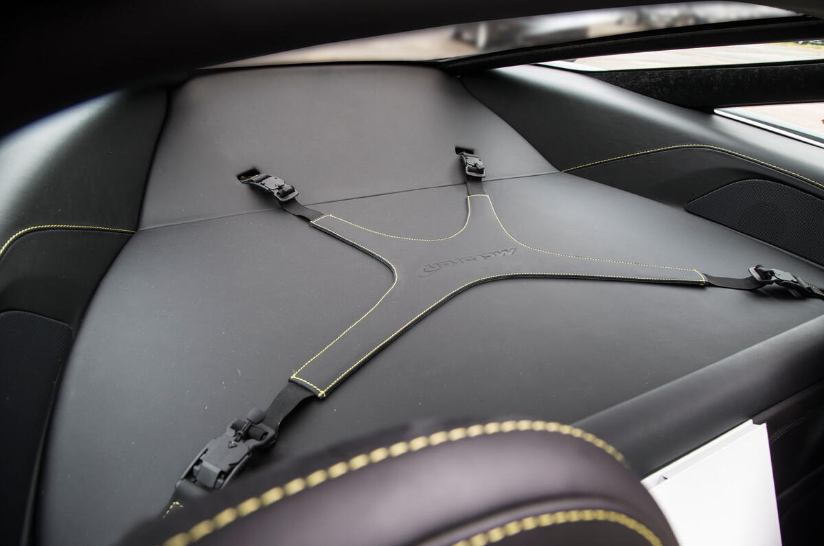
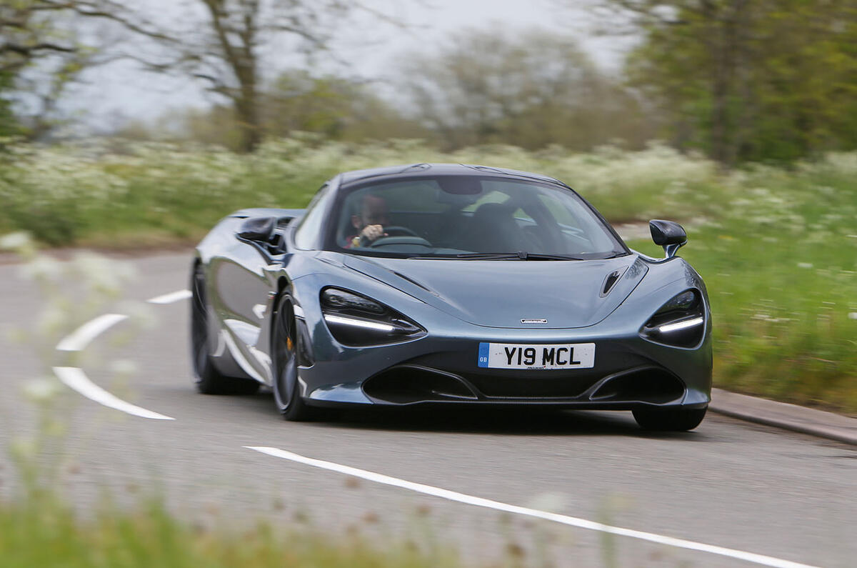
There’s plenty else to talk about in this road test, so we won’t dwell on the interior for too long.
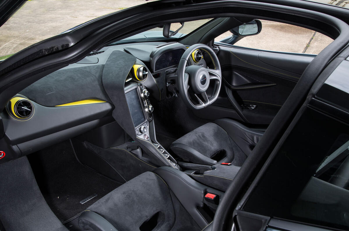
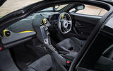
Suffice to say that it’s a marked improvement over that of the 650S, from the moment you get in it until the moment you start to use it.
First and foremost, then, it’s easier to get in and out of than any other McLaren, 570S included.
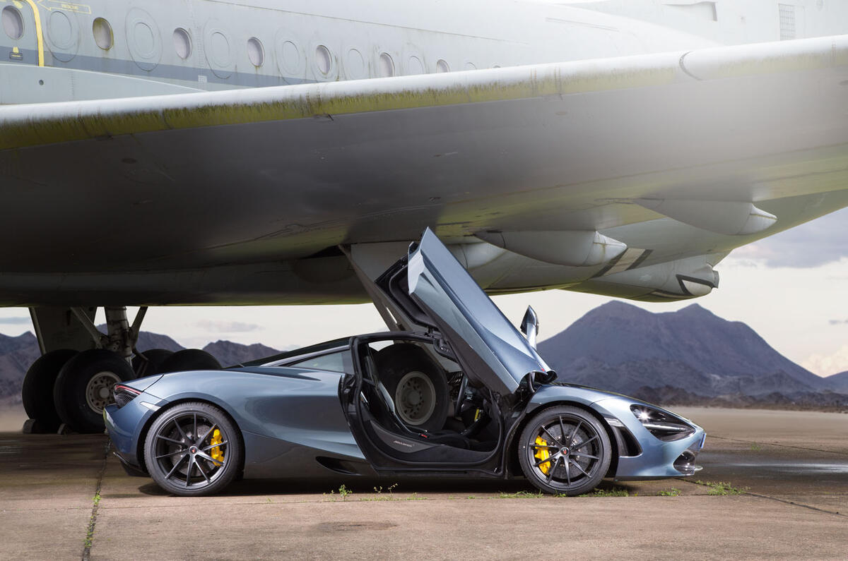
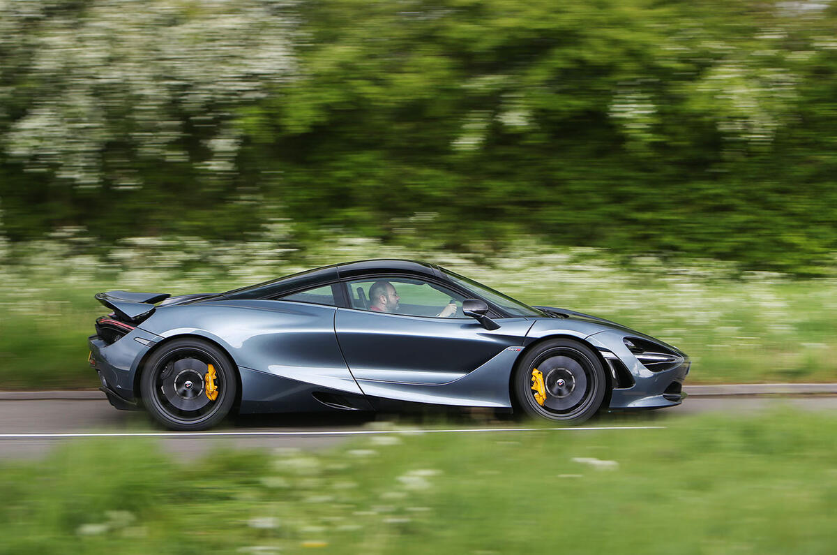
Partly it’s the lower sill of the Monocage II and partly it’s doors that open wide, but mostly it’s that they cut into the roof, letting you step over rather than limbo across the sill.
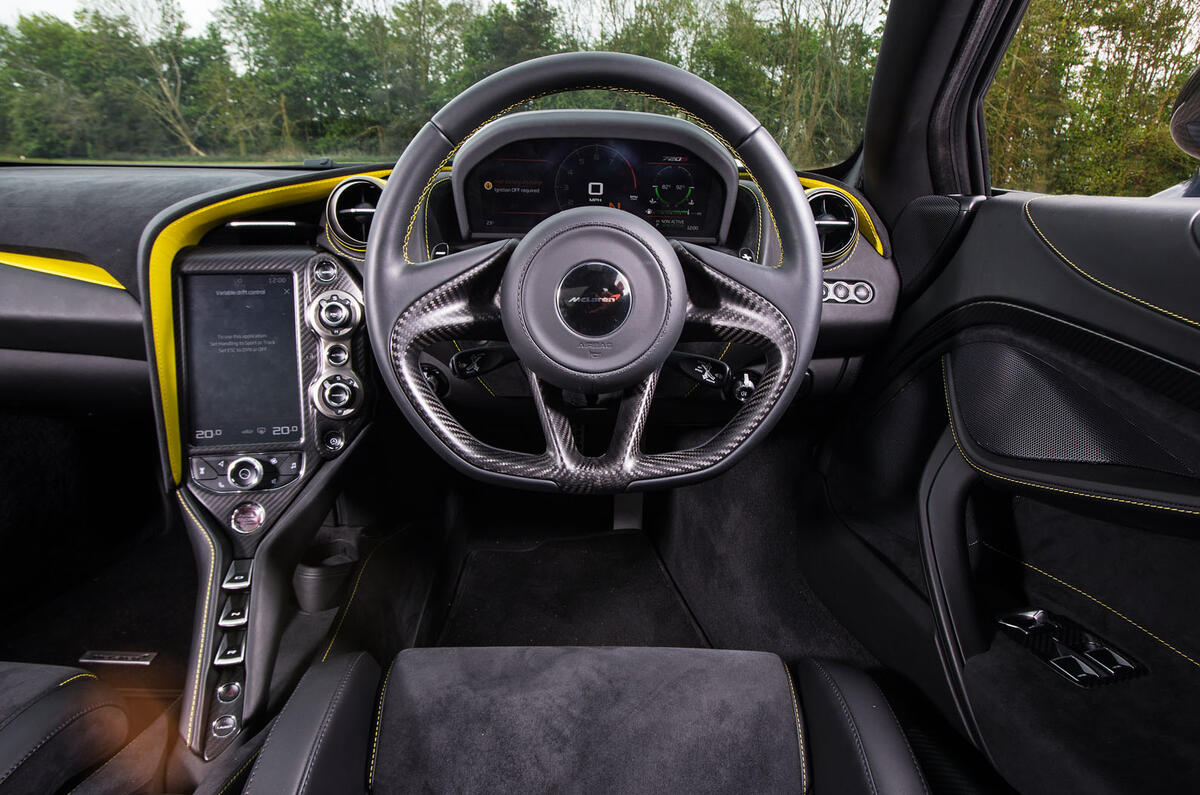
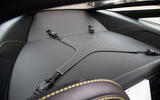
Once you’re inside, things are good. The driving position is dead straight, brake pedal central, as we’ve come to expect, and the optional, fixed-back sports seats of our test car are comfortable even over distance, as long as you push your lower back firmly into the backrest.
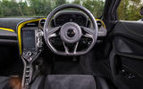
If that leaves you too upright, consider a standard seat. If you do, there’s no worry that the steering wheel – nearly round and perfectly sized – won’t reach you, because of its extraordinary reach and rake adjustment.
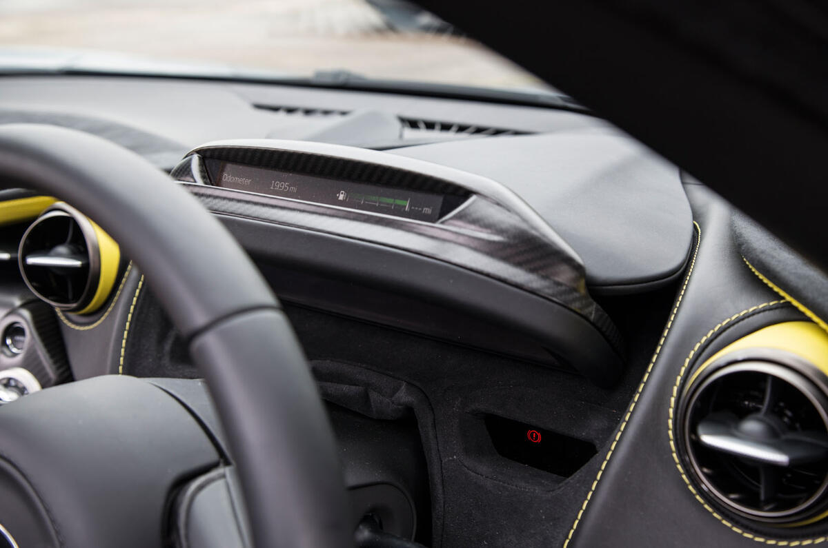
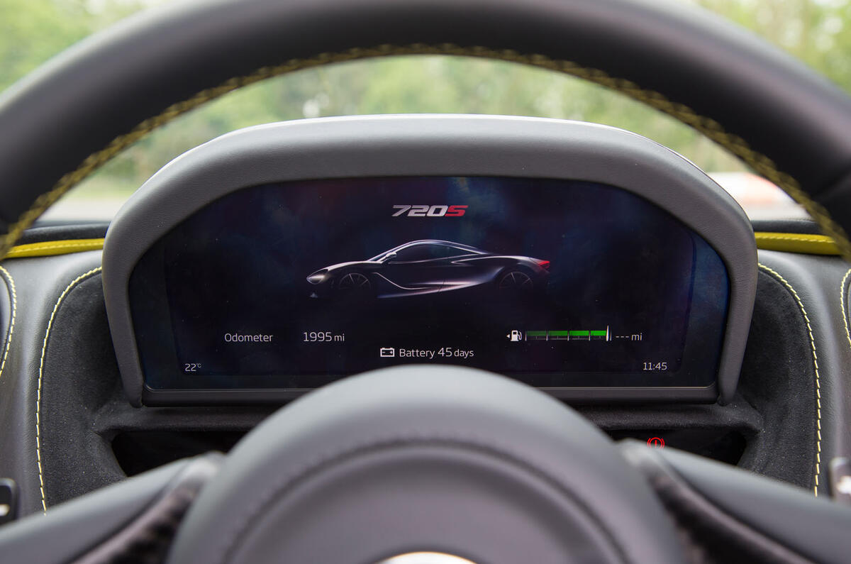
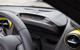
The 720S gets new, all-digital dials on a fold-out display that’s a bit gimmicky and is arguably the 720S’s weakest point.
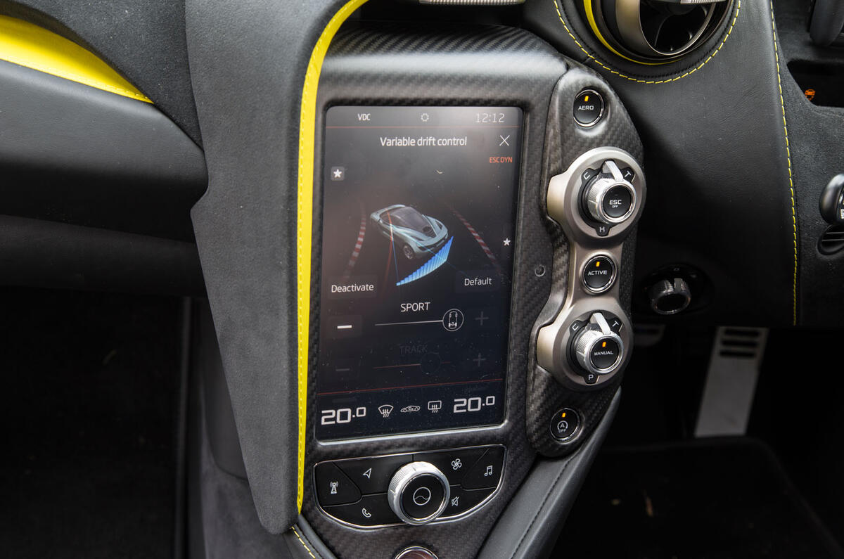
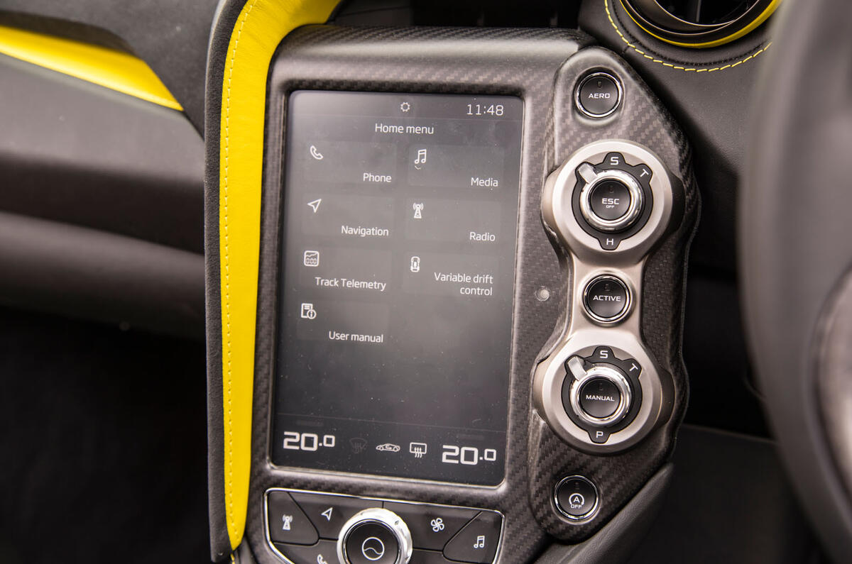
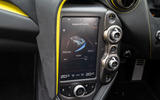
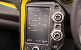
It combines with an infotainment system that’s light years ahead of McLaren’s old IRIS system but is less intuitive than it could be – although it’s much better than a Ferrari or Lamborghini set-up – and the ‘active’ panel on the dashboard remains far too complicated for its own good.


