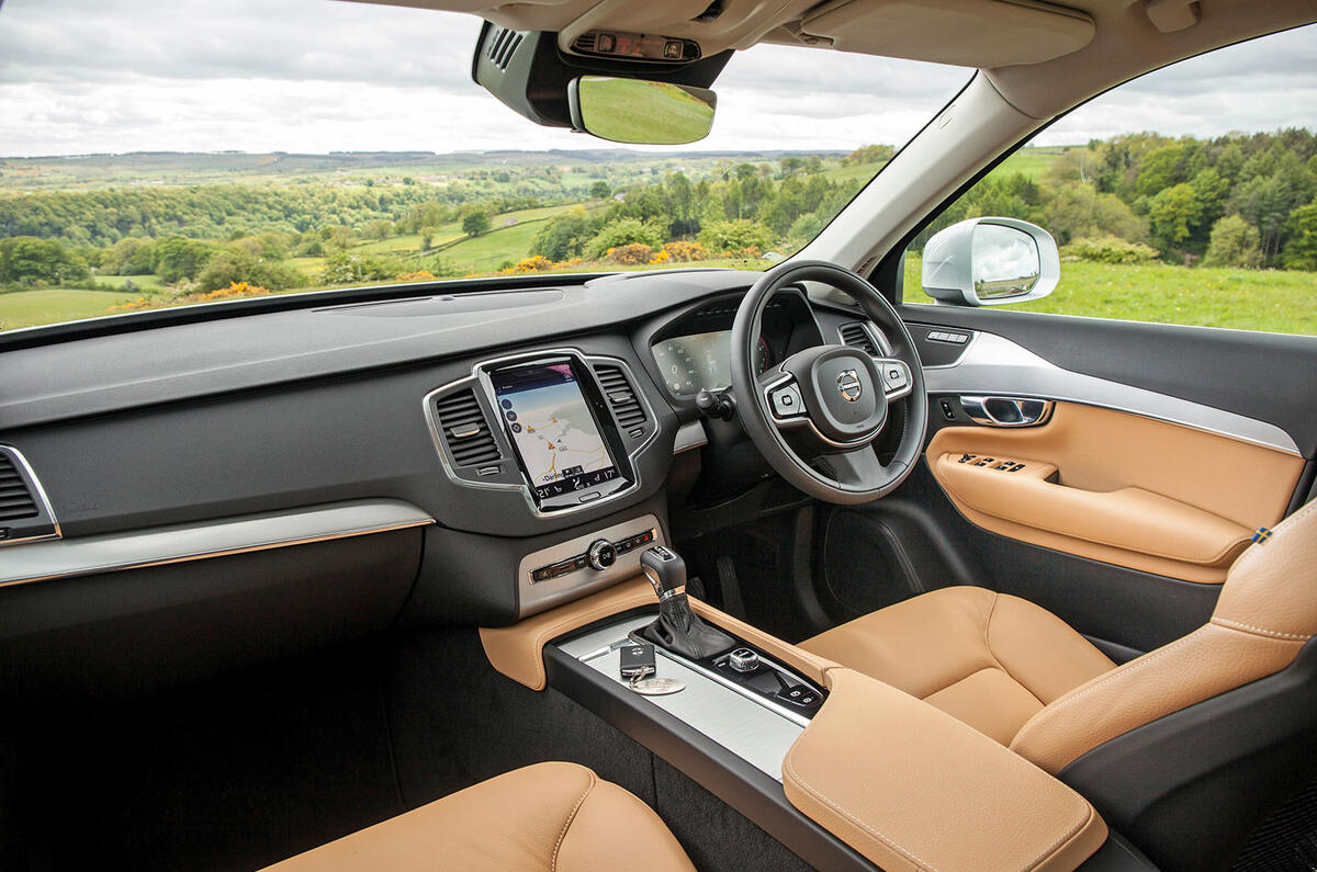
Look, I’m sorry about this, I really am. I’m as guilty as anyone.
As soon as a car maker says it has reduced the number of buttons it uses on the dashboard of a new car, I’ve been front-row and centre, politely golf-clapping like everybody else, commending them on a job well done for cleaning up that dreadful car interior, so it looks much nicer.
Bravo. Well done, finally banishing those awful cabins that look like low-end stereos, with all that black plastic and diddy buttons strewn all over the place. Let’s have more of that cleaner look, the one that resembles a Swedish bedroom, with loads of light woods, soft fabrics and little bits of sun-flecked satin-finished metal. Bring on the warmth, the welcoming lightness. Ah, yes, the future.
Except, actually, sorry, don’t. Not to this extent, anyway. It’s not that I’ve changed my mind per se, it’s just that, well, it’s gone a bit too far. Car firms have become like a puppy that doesn’t know when a game isn’t amusing any more because much of my arm is now inside your mouth, bleeding.
The great button reduction programme has become a populist movement that needs an intellectual check. I think in contemporary cultural terms it’s called ‘jumping the shark’, although it sounds as ridiculous when applied to a car as it does when attributed to a television programme. But basically it means: don’t take all of the buttons away.
There comes a point, you see, after you’ve removed so many buttons and replaced them with icons in sub-menus on a touchscreen, that, quite frankly, it becomes almost completely unusable while driving. It’s almost – and I choose this word carefully – dangerous.
Yes, it’s fine to hide certain car functions – and Lord knows, cars have a lot of them these days – within menus if you’re not going to want to use them very often. It makes total sense to have most navigation options a couple of menus away, perhaps, too, the radio bandwidth selector, or the way to turn lane-assist warnings off and on.
But there are some things you shouldn’t hide beneath a sub-menu, no matter how clever and intuitive you think the touchscreen is, because I’ll tell you now, compared to a button, it isn’t. Heating and ventilation controls, the heated seat control, the only way to scroll through radio stations: leave ’em be on the dashboard.
Actually, while I’m confessing: this whole touchscreen thing in general. I used to really like a touchscreen. I still do, in a way. But it’s hard to hit the right icon on a touchscreen when a vehicle is moving. I don’t know about you but when I’m driving, I want to look at the road a lot, almost all of the time, ideally, so I choose my moments to adjust settings carefully. But I can’t hover my finger over an icon indefinitely while not looking, and picking the right icon and hitting it takes deliberation and time. A rotary dial with – guess what? – a button to assist with the controlling, doesn’t.


