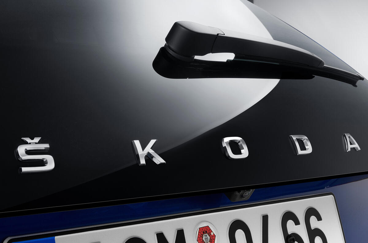
The new Skoda Scala won’t be revealed until early next month, but the Czech firm has already teased several of its design features - including the fact that it will be the firm’s first model to have 'Skoda' written out on the bootlid instead of its logo.
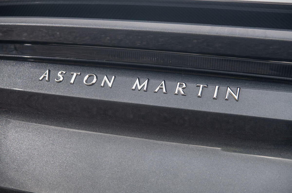
That approach, first shown on the Skoda Vision X small SUV concept earlier this year, isn’t just a one-off: it’s going to be used on every new Skoda model going forward. And it isn’t just Skoda that’s swapping logos for letters at the back of its cars; the new Aston Martin DBS Superleggera, for example, has letters instead of the British firm’s winged logo. Other firms are following suit too.
It’s a relatively minor change in style, but one that attracts plenty of attention. So where did the trend come from? The answer, as with so many other current car design trends such as the increasing use of chrome and bold grilles, is China.
Asked by Autocar, Skoda design chief Oliver Stefani explained: “Everyone here [in Europe] knows which brand is which from their logo, but China doesn’t have that heritage, because they didn’t grow up with Skoda, or Alfa Romeo, or other European brands. So by writing Skoda out, it’s really clear which brand of car they’re looking at.”
Stefani is currently leading the development of a new, more ‘emotional’ design language at Skoda - which you can translate as being sharper and bolder-lined, with more character and style. But Stefani says it’s vital for Skoda that its design follows what came before it - and that extends to spelling a name out.
“When we did it on a model to see if it looks right, we really liked it,” he added. “Then we looked into our museum and found cars from our past that had the name spelt out on the rear, so we always had the heritage to introduce it more widely - and to do so proudly.”
Judging by some of the reaction to the name-on-bootlid trend, not everyone is a fan. When executed well, I think it can look quite stylish - although I am a little sad about anything that reduces the importance or emphasis of a car firm’s logo.
Many logos are positively dripping in character, heritage and history (which you can read about in this excellent piece), and are a huge part of building brand appeal. Clearly, it’s not like those logos are going to disappear; companies such as McDonalds, Starbucks, Apple and even Ferrari demonstrate how important an instantly recognisable logo is when building a global brand.
But they only work once people can link the brand to the company - which is what spelling out a brand’s name on a car is designed to achieve. Hopefully, once car firms feel they’ve got their brand name established in China, they’ll be proud to push their logos again.
I’d be intrigued to know what you think looks better on a bootlid: logo or brand name?


Join the debate
Add your comment
It's a crying shame for B I G
It's a crying shame for B I G L E T T E R S to replace the badge/logo. The DBS emphatically proves that -- it's a crime that the wonderful Aston wings are totally absent from the rear (btw, good-looking car overall, but the beautiful and iconic Aston grille is much too HUGE ). As someone mentioned, having the badge and the lettering doesn't work either -- it's just too much, too fussy. If the marketing department did its job, the brand recognition would come without resorting to this.
Much better. I wish SEAT
Much better. I wish SEAT would ditch just putting an S on their cars. Too similar to Suzuki.
What goes around comes around
I remember VW dropping the "Volkswagen" script from the rear of the MkII Golf for the 1988 model year, enlarging the logo, and moving it from the left to the centre of the rear panel. The reason given was that everybody knew the logo, so no script was needed. Other brands followed suit.
About 20 years later many brands that were now expanding into new markets, where not everyone knew the logos, decided to bring back the scripts. Renault added it to the Mégane II at the first facelift (2006?), as their logo wasn't as well known in Russia, India, Romania ...
Presumably the same issues apply in China now as in other markets a decade ago.