Currently reading: Inside story: The best car interiors of all time

Which cars have the best interior features of all time and why? We name the world’s finest (and worst)

As enthusiasts, we spend our lives admiring the styling of cars.

We gaze at their shapely spoilers, drool over their curvaceous wings and stare at their plunging rooflines. But when we actually use cars for the purpose for which they were built, that’s not what we see at all. For every minute we spend looking at our car’s exterior, we spend hours, maybe even days, looking at its interior.

And you don’t have to think hard to know which designer has the more difficult job. Exterior designers whinge as one about how difficult the job of making cars look cute while obeying all the latest crash regulations has become, but they’ve got it easy compared with those on the inside. Interiors must not only be safe, but they must also be ergonomically sound, offer decent visibility, present information both beautifully and clearly, accommodate occupants of all shapes and sizes, blend state-of-the-art tech with traditional materials, provide storage space and accept many different colours, all while coaxing and cajoling a bewildering array of materials from plastic to carbonfibre past wood, metal and leather into some kind of harmonious co-existence.

This, then, is our tribute to some of the greatest interiors, and interior features, from a wide range of cars from today and yesterday – as well as just a few that, in often somewhat bizarre ways, failed quite spectacularly to come up to the mark. The list is nothing like exhaustive and you may have many ideas of your own. If so, we’d love to hear about them. In the meantime, however, welcome to the wonderful world of automotive interiors.

GENERAL INTERIOR AMBIENCE

Just like the outside, the interior is part of the promise on which the car beneath must deliver. An interior is a statement – an invitation to treat, for you legal eagles out there. In one glance, it tells you what kind of driving experience you should now expect. In terms of setting the scene for what is to come, there is nothing more important.
F40

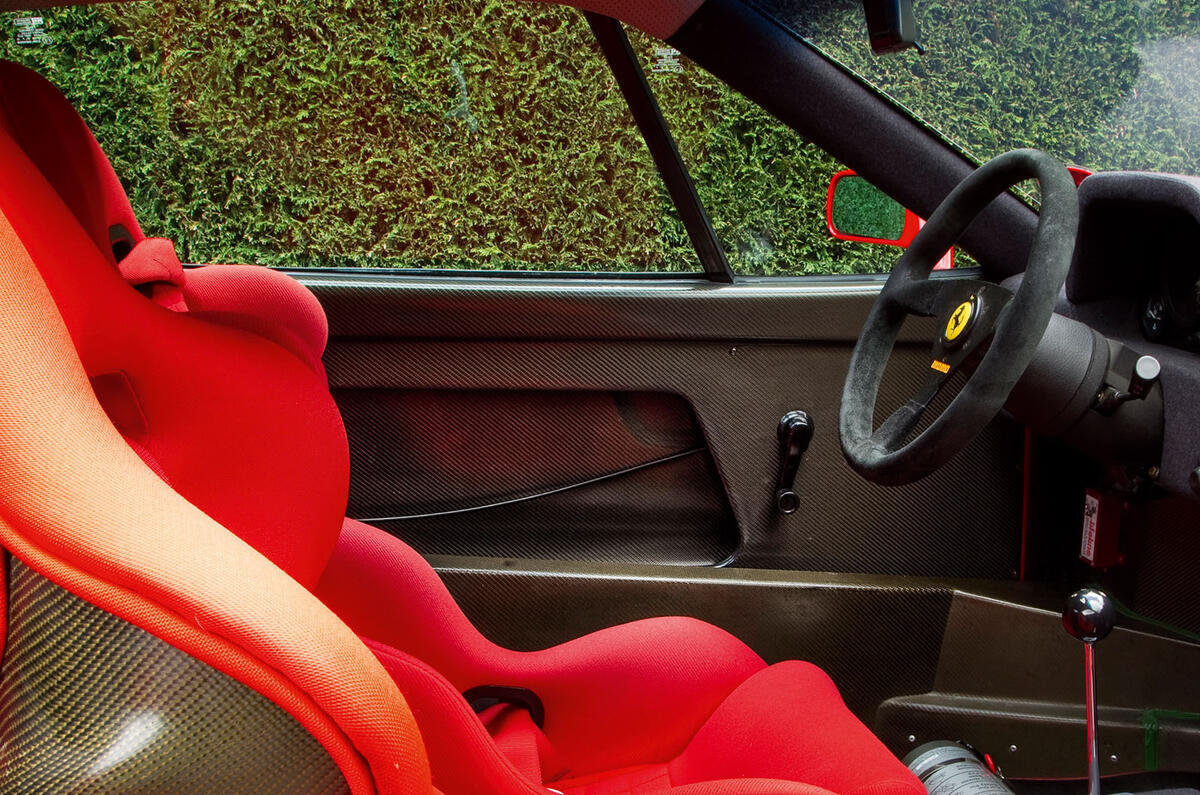
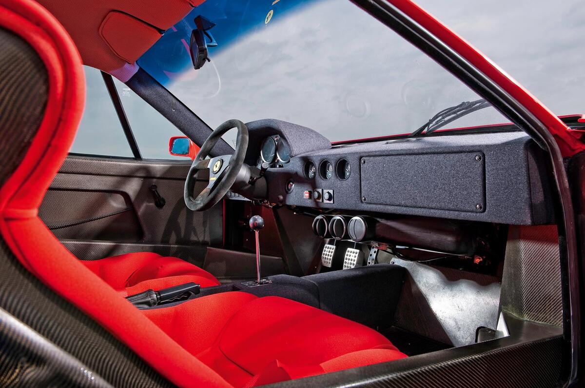
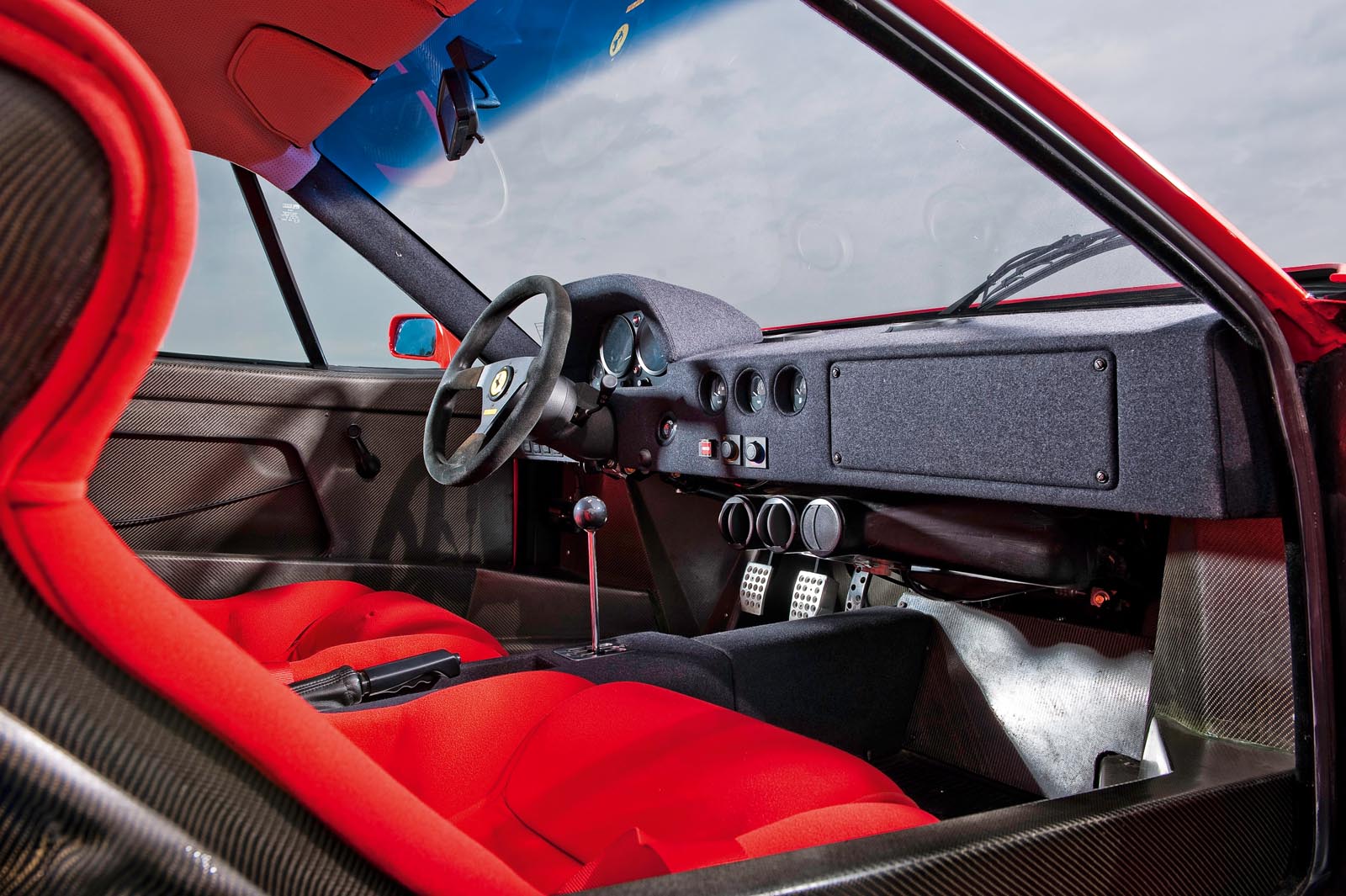
And no car ever set that scene better than the Ferrari F40. You sit in a carbonfibre channel and look around trying to spot a creature comfort. You soon give up, because there is none. It’s a place to focus on your driving and nothing else. Even the top of the dashboard is just a strip of matt black felt, all the better for killing reflections on the screen. 

Advertisement

Read our review

Car review

Ferrari's F40 was built to celebrate the firm's 40th anniversary, and in 1988 Autocar got behind the wheel to find out just how good it really was

Back to top

Rr

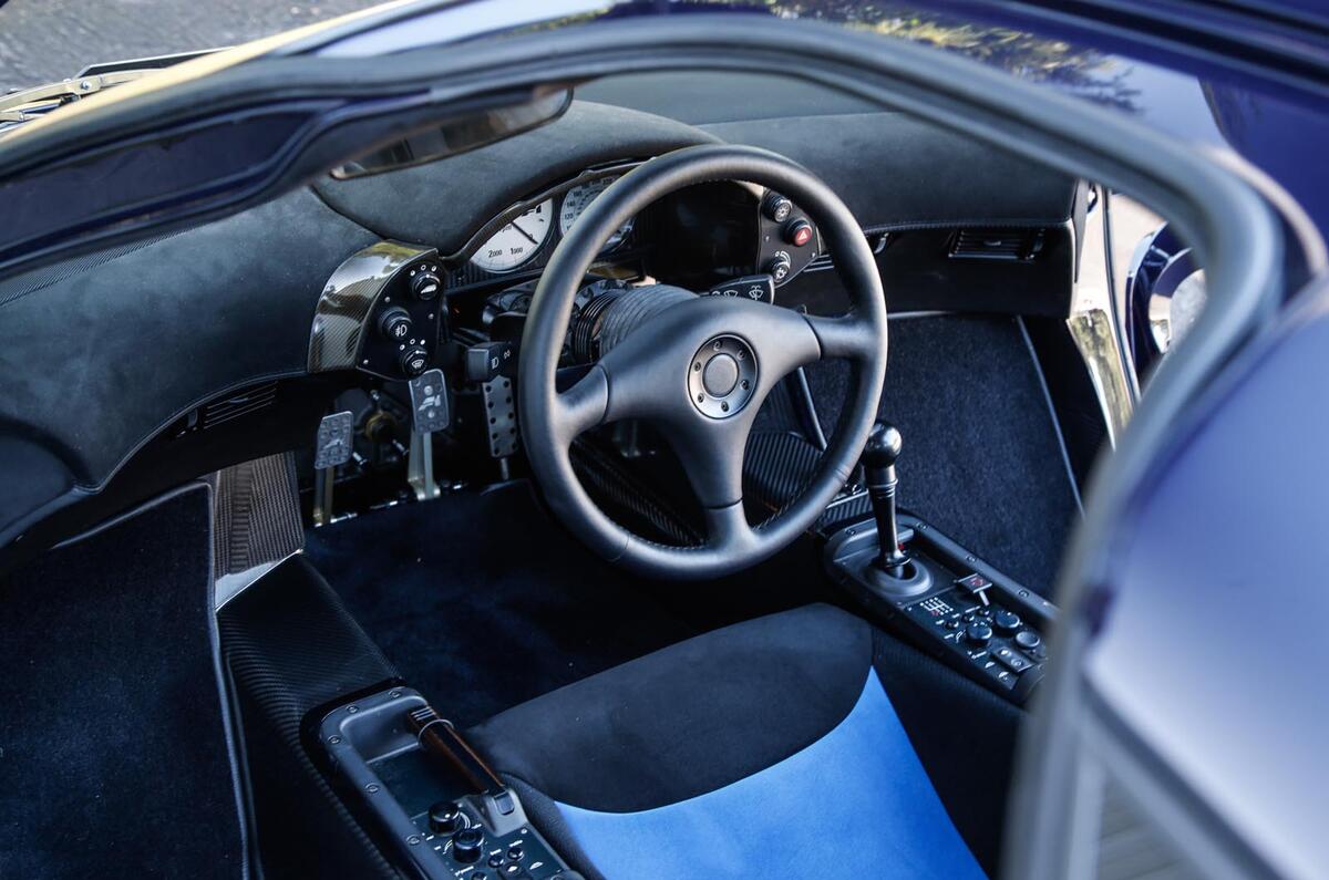
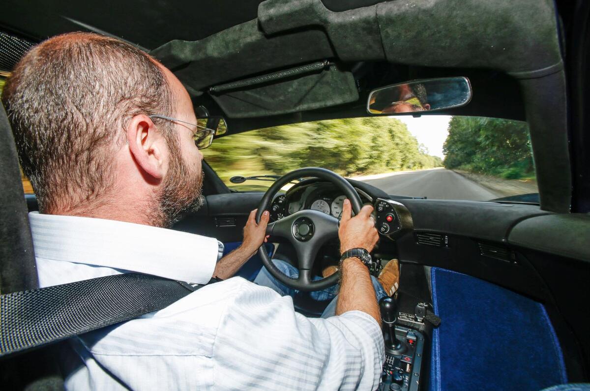
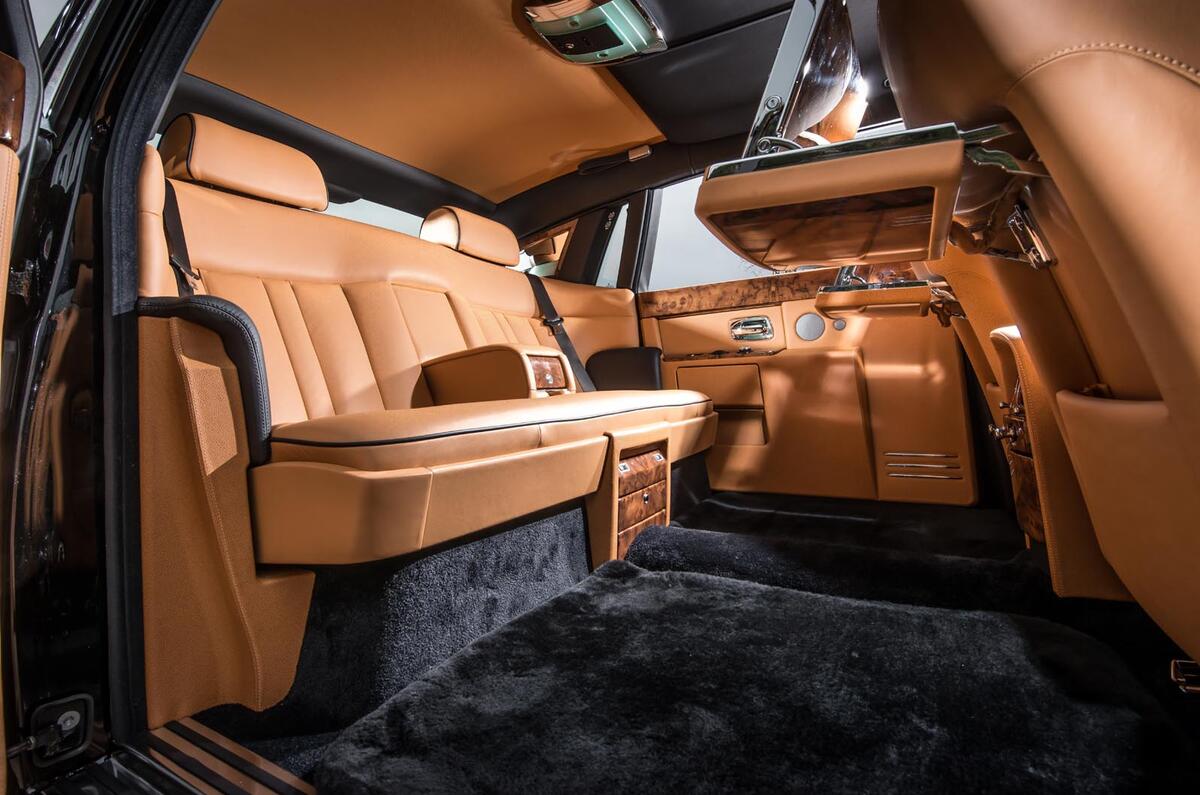
Unsurprisingly, the Rolls-Royce Phantom takes the opposite approach, and you’ll know it from the moment your feet disappear into a forest of lambswool rug. Everything looks and feels as if it were designed not in CFD by computer wizards but in a studio by craftsmen with pencils behind their ears. Long may it remain that way. But there was never any greater single statement of intent than the McLaren F1’s central driving position. Nothing could speak more clearly of the absence of compromise that went into the car’s creation. And when you drive one and understand the benefit of always being the same distance from an apex regardless of the road’s direction, you’ll know this is no mere gimmick. It’s an idea of genius simplicity.

STEERING WHEELS

Given that this is the primary interface between man and machine, it’s astonishing how many car manufacturers still don’t understand what matters most in a decent steering wheel. The idea should not be to see how many buttons you can cram onto it – Formula 1 cars only do this because they don’t have dashboards – but to provide a wheel of the perfect diameter, avoiding the temptation to go too small in the mistaken belief that it looks cool. It must be covered by a material that is soft yet grippy, and, crucially, firm to the touch.

Ferrari 308

Back to top

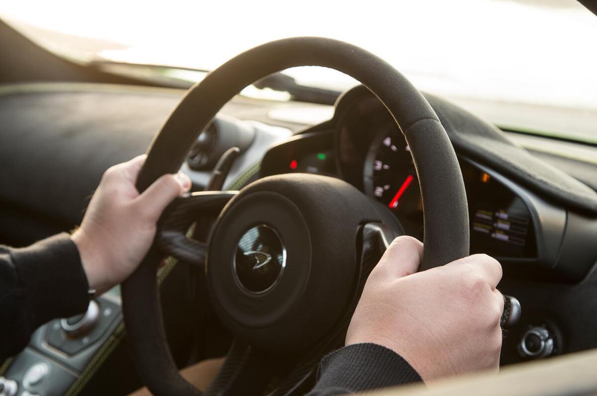
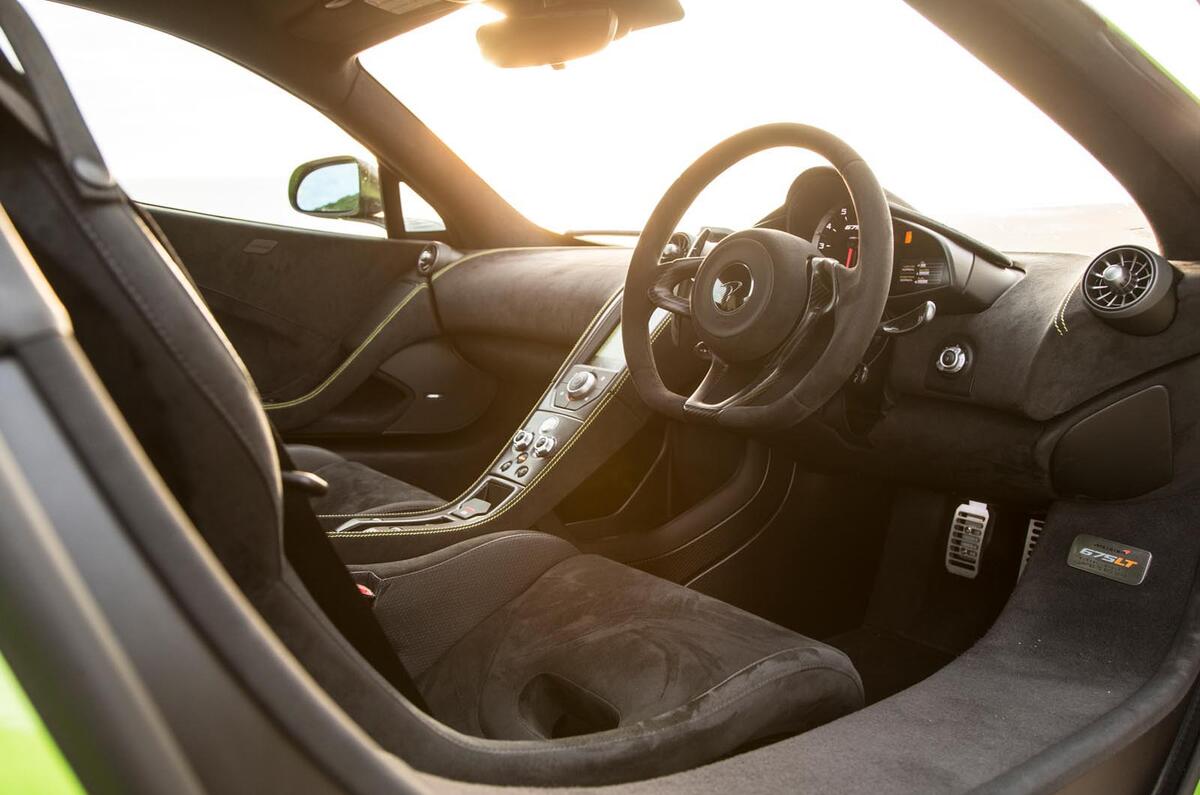
My current favourite is that of the McLaren 675LT, because despite the car’s outlandish spec and the temptation there must have been to splatter buttons all over it, all it does is steer the car. Its rim is Alcantara, its spokes carbonfibre, its base slightly flattened to clear the knees a little better. That's it, and that’s all it should be.

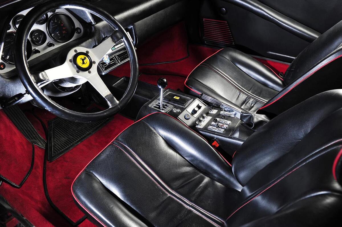
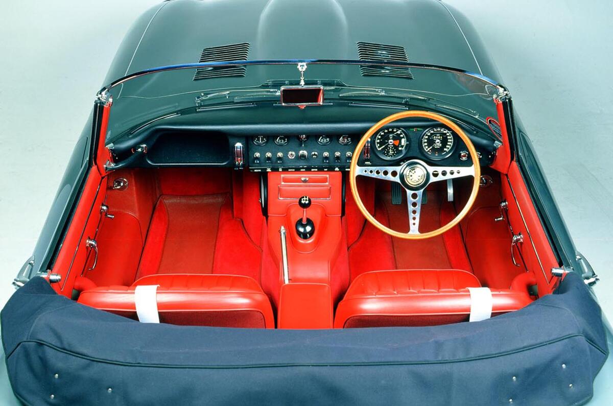
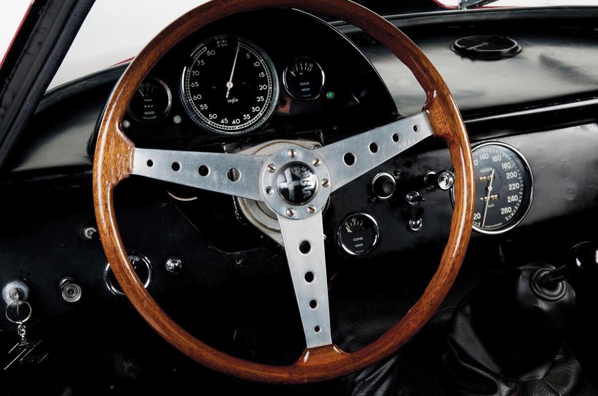
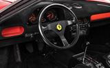
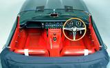
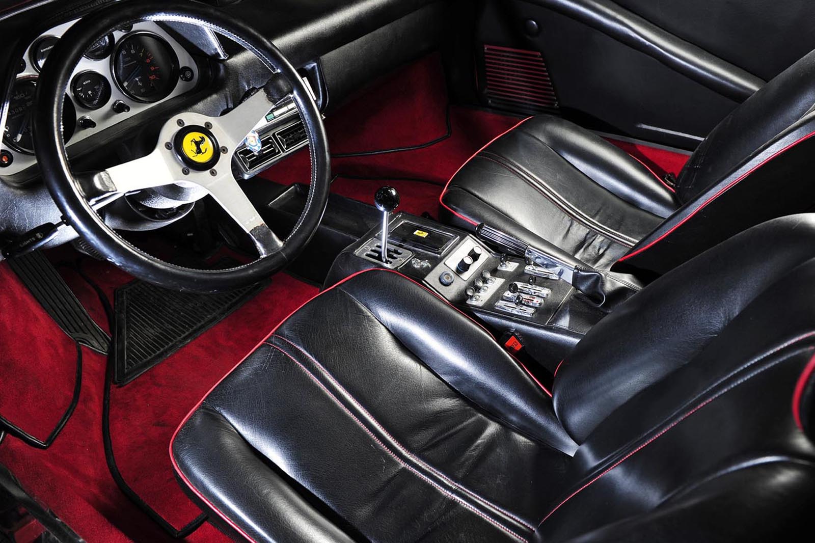
But the sucker in me still falls for a 1970s Ferrari wheel. The Momo design with three simple, silver, unperforated spokes, a black leather rim and finished by an egg yolk horn bearing a prancing horse emblem is, to me, the classic steering wheel, even more so than the wood-rimmed wheel with its perforated spokes of the Jaguar E-Type. Ask me to name the most beautiful car steering wheel there has ever been, however, and I’d probably go for the Hellebore wheel of a 1965 Alfa Romeo Giulia GTA.

PEDALS

They don’t need to be beautiful. Tucked down deep in the wheel well, pedals are only ever seen by us when we’re looking for the bonnet release. But that hasn’t stopped some trying.

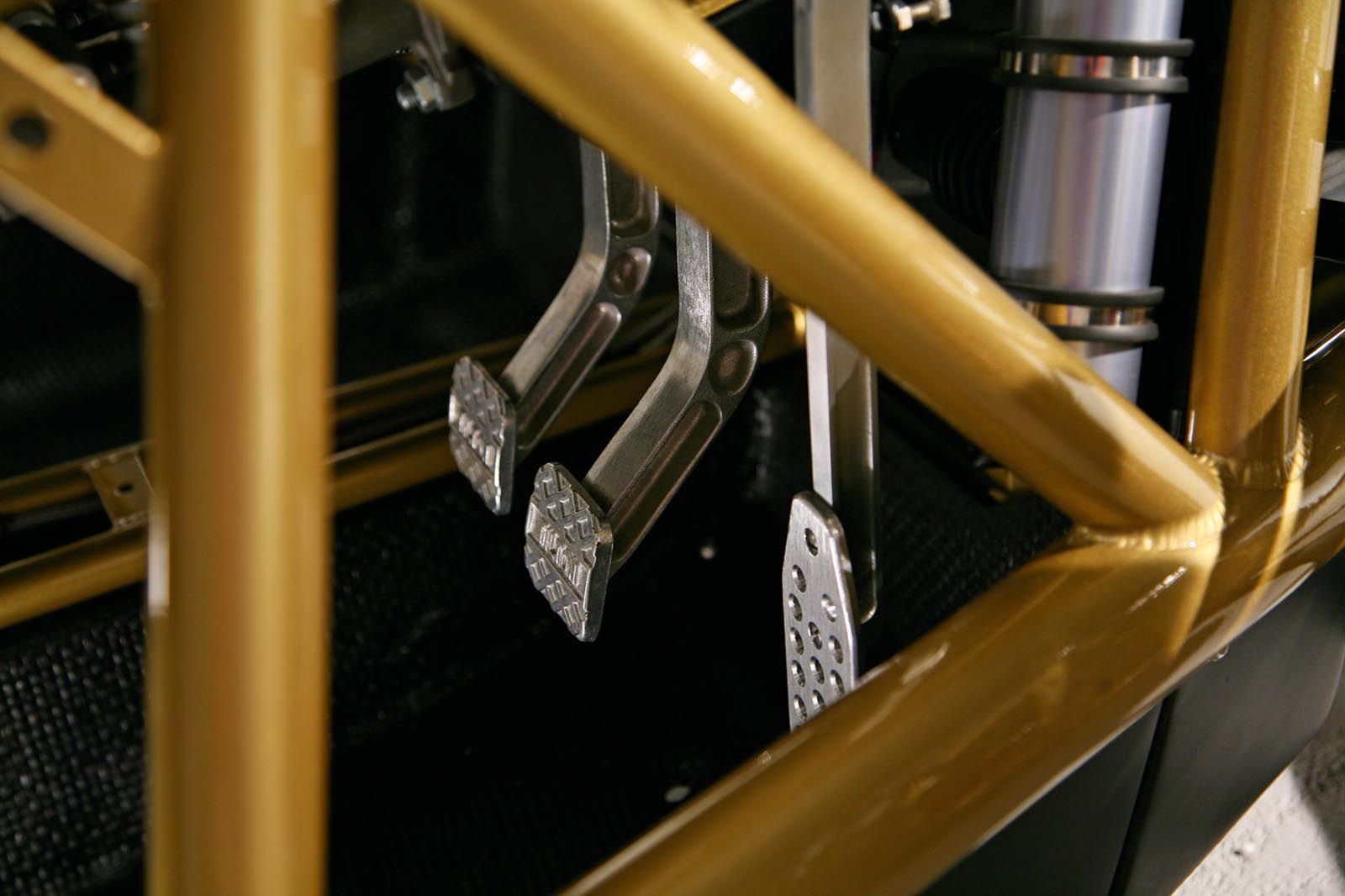
And I make no apology at all for name-checking the F1 as the owner of the greatest set of pedals yet created, largely because they’re made from titanium so light that they’d float away if not tied down. As with every aspect of the F1’s design, true beauty was achieved by forcing form to follow function, reinforcing the promise that the car was like no other on earth.

But I like those of the Ariel Atom almost as much. Beautifully designed by Tilton, these pedals are so expertly positioned that they make heel-and-toe down-changes childishly simple, which, as anyone who has ever tried to drive an Atom properly fast will tell you, is not just fun but a crucial safety device, too.

Atom

Back to top

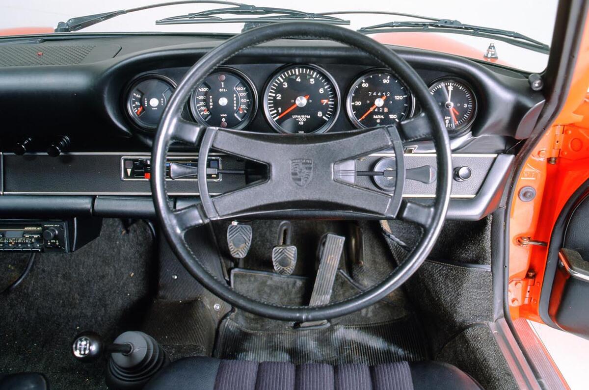
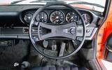
To be honest, the pedals of an old Porsche 911 aren’t pretty but, hinged on the floor, they feel unlike those of any other car. Some drivers simply can’t get on with them, but those who do click with them miss them the moment they drive anything else.

Finally, the Maserati Bora’s pedals are here not for themselves but for the box into which they are built; it slides up and down the footwell to meet your feet rather than the other way around. Again, an idea of pure genius that, disappointingly, has rarely (but not never) been used since.

INSTRUMENTS

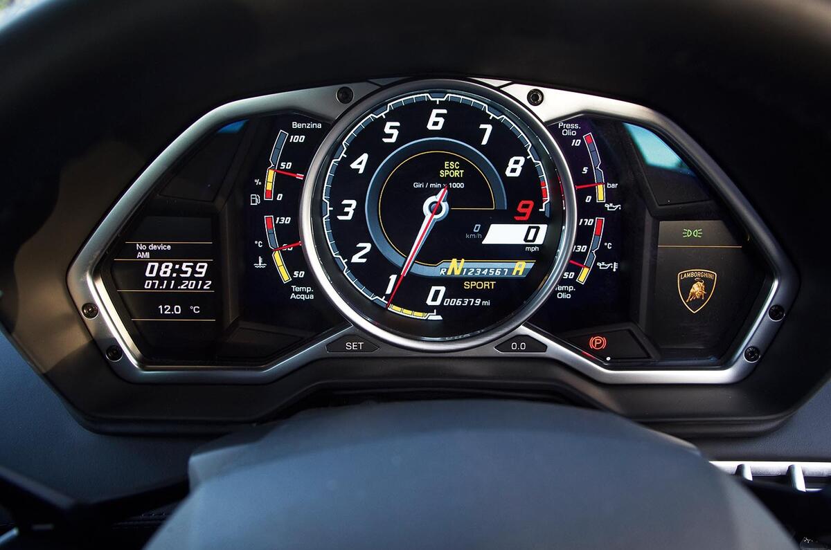
Space is short and the choice almost unlimited, so we’ll start with the Lamborghini Aventador. A car that looks like a fighter plane really should have an information display like that of a fighter plane, and this Lamborghini does not disappoint. Its TFT screen looks like something out of Star Wars, lacking only a set of electronic cross hairs and a missile lock alert to complete the picture.

E21

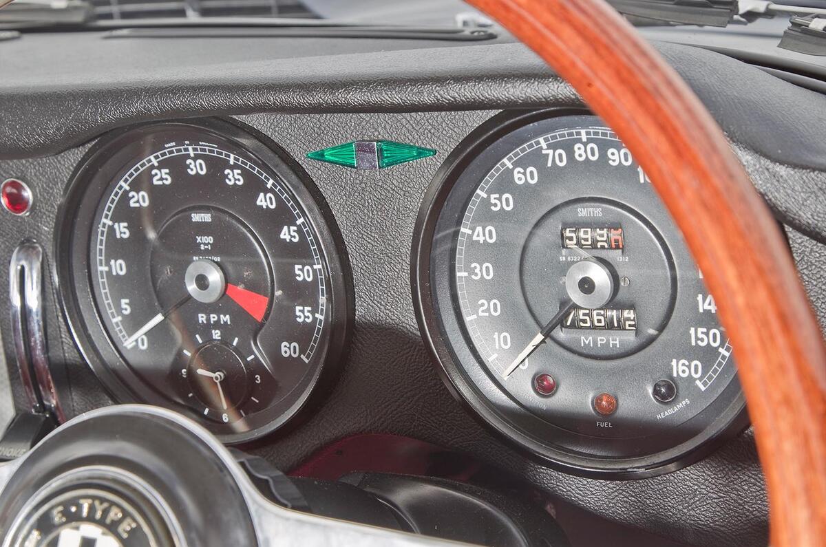
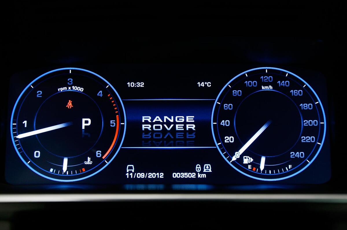
Fancy something a little more classical but still contemporary? The current Range Rover clocks are just TFT projections, but the way they can be programmed to illuminate only the part of the dial pointed to by the needle is very clever and rather cool. Further back in time, the gauges of the Ferrari 288 GTO, with their squared-off numerals and fat orange needles, speak brilliantly of their period, as do the simple, clean and achingly cool dials with which the E-Type was born.

Back to top

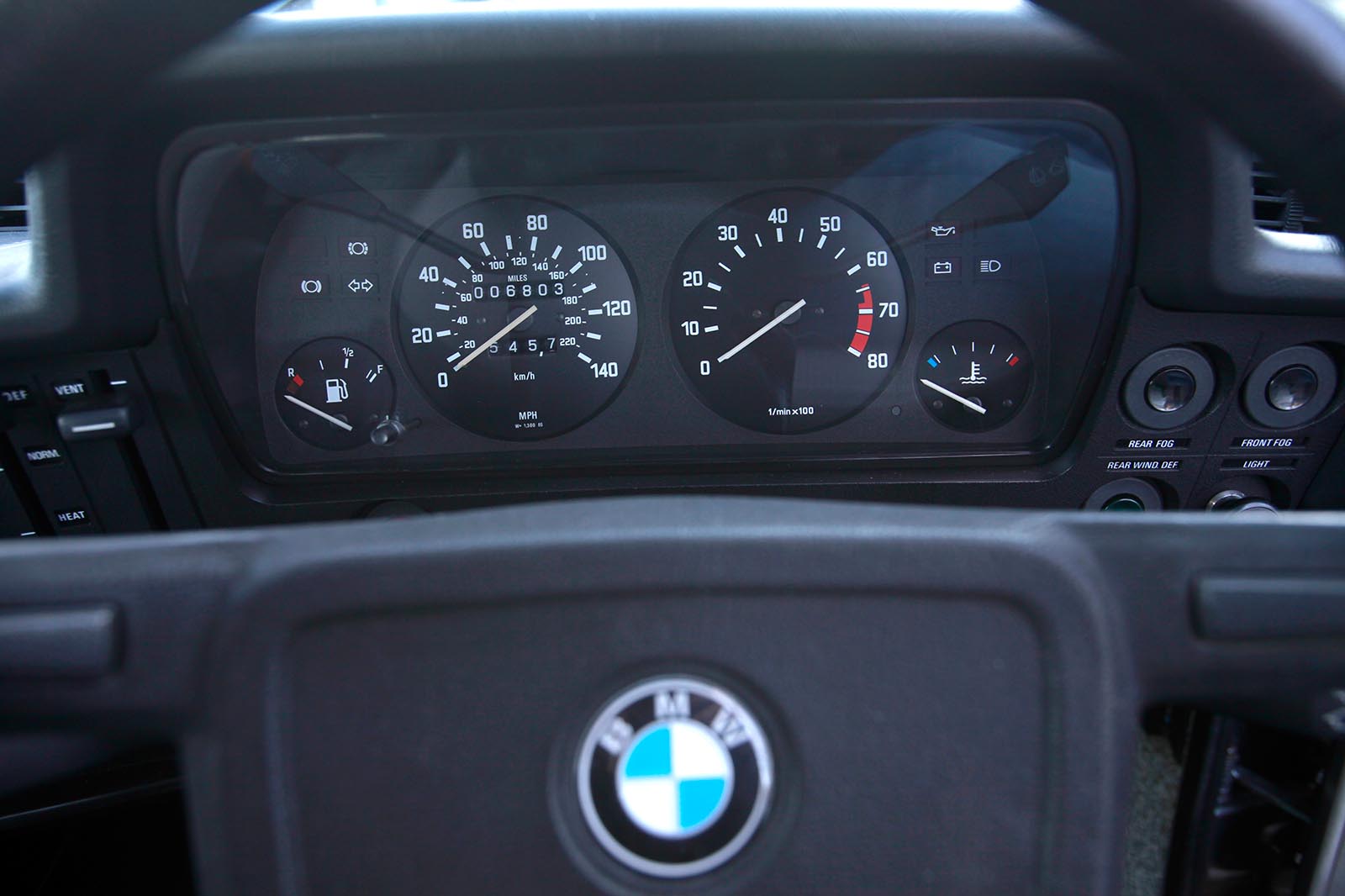
But the best instruments of all, for their functional beauty and unsurpassed clarity, belong to a very humble BMW, namely the very first 3 Series, the E21 of 1975. I was a kid when I saw them for the first time and I thought they were as good as such things got. More than 40 years later, I’ve seen no reason to modify that view.

GEARLEVERS

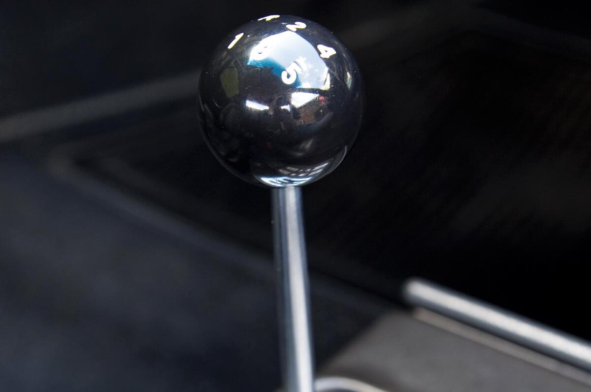
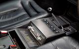
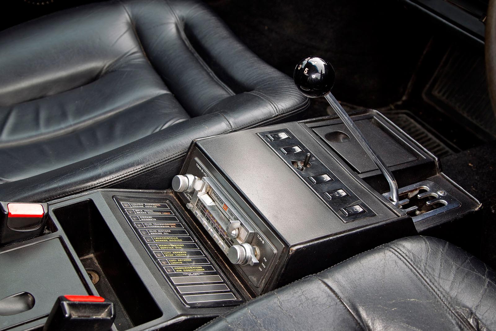
No apologies for putting another old Ferrari in here, and almost any two-seater from the mid-1960s to the 1990s will do. That short steel shaft, topped by a simple black ball, scraping its way around an exposed six-position gate… it’s almost as symbolic of the world’s most revered sports car manufacturer as the howl of one of its V12 engines.

Ferrari mondail8 stu 039

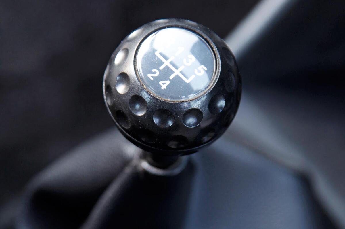
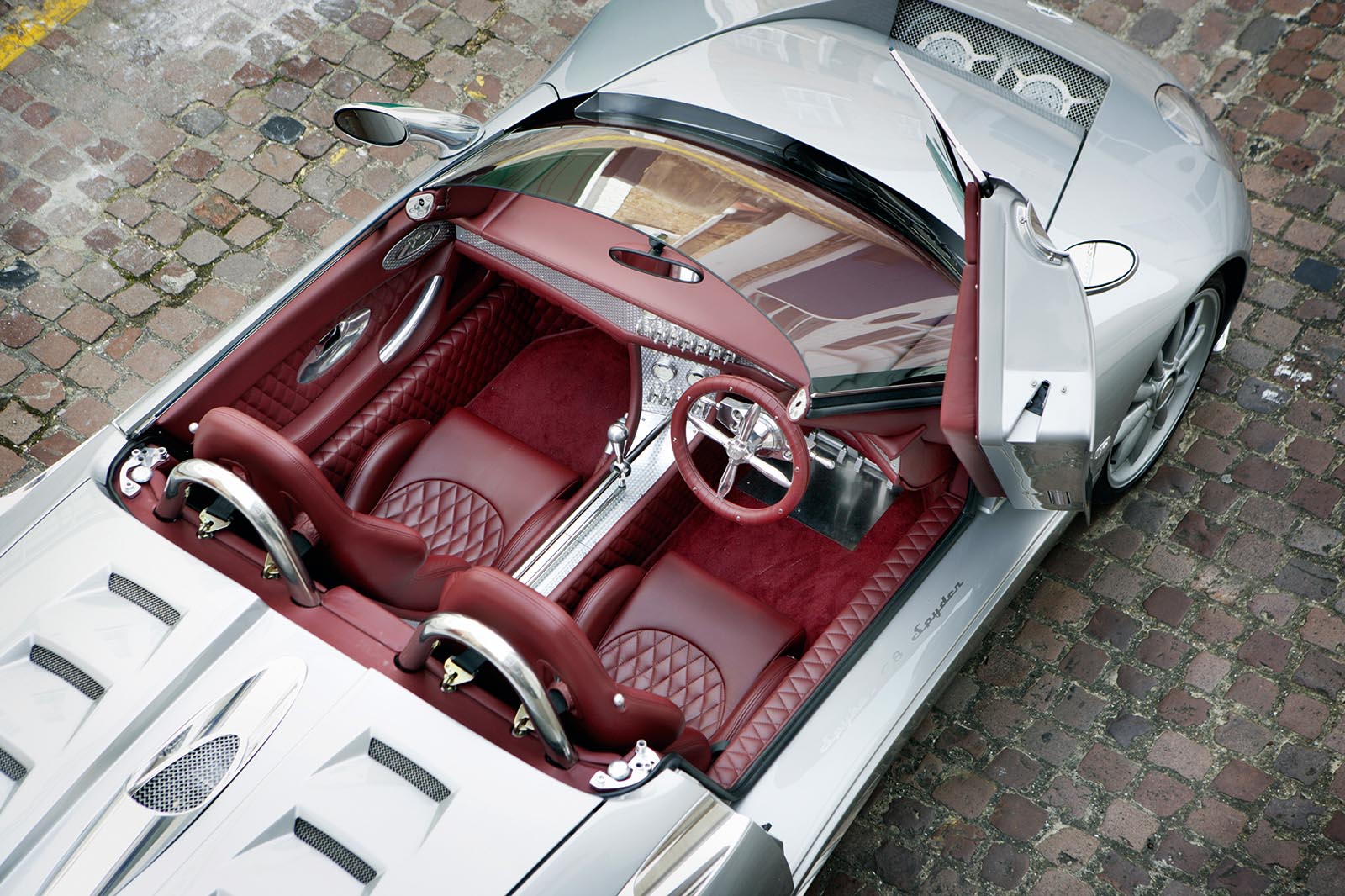
Rather more accessible but no less charming was the golf ball shifter on early Volkswagen Golf GTIs, a feature that came with the happy side effect that it was very pleasing to grip and use. Few would say the same of the push-me-pull-you gearstick of the Citroën 2CV, but those who drove them loved them. The top also unscrewed, allowing small quantities of contraband to be hidden from prying eyes. At the other end of the spectrum lies the gearshifter of the Spyker C8. It sits shining on its own, unapologetically exposed linkage, its mechanism laid bare. It’s so beautiful that it seems almost a shame to use it.

DOORS

Back to top

Door handles come in all shapes and sizes. As one of the few parts of a car interior guaranteed to be looked at and touched frequently, it’s no wonder that designers make a real effort with them. But sometimes the best results come from making no effort at all, as Ferrari did with the F40. A simple cord looking a bit like a length of clothes line is all you get and all you need to make the perfect pared-back promise.

Spyker 007

We can even get excited by door bins or, to be precise, one particular door bin. While others are designed to hold only the ignoble – tissues, house keys, cans of fizzy drink – those of a Lancia Stratos were shaped to hold a crash helmet, providing the perfect place to hang your hat between special stages.

AND THE WORST...

There have been some truly dreadful interiors and interior details over time. High on the list of the most ghastly must come the original Austin Allegro. The brown plastic was bad enough, but the square or ‘quartic’ steering wheel was an abomination. Then there is the indecipherable dashboard of the Citroën GSA. The plan was for it to look modern, French and funky. It didn’t work. But it was probably better than the dash of the Lancia Trevi. Kinder reviewers said it looked like a Swiss cheese, but to me, it seemed to have caught some awful necrotising disease that was slowly eating its way through the fascia.

Back to top

Over at Alfa Romeo, someone thought it a good idea to put the speedometer of the 1975 Alfetta GTV right in the middle of the car where no one could see it. But probably the greatest ergonomic disaster was BMW’s original iDrive system. With a controller that moved in eight directions and, at first, had no home button, it was inexplicably complex and utterly infuriating to use. But it has survived and Audi and Mercedes have been forced into designing their own versions, suggesting that there was nothing much wrong with the design and it was only the execution that was so catastrophic.

This article was originally published on 28 December 2016. We're revisiting some of Autocar's most popular features to provide engaging content in these challenging times. 

Read more

Smooth sailing: How to build the most comfortable car​

Spyker C8 review

Top 10 best super-luxury cars 2020​

Join the debate

Comments
26
Add a comment…
Make Car Window... 15 August 2020

The fresh air vents on my metro.

The pre heat/ cool feature on my Nissan Leaf before I get in.

The no gears on my Nissan leaf


artill 15 August 2020

I do like the traditional BMW

I do like the traditional BMW dials. So simple, and yet they tell you all you need to know. Shame they like everyone else have moved to a TV screen instead. Jaguars of the 60s were great once they moved the main dials behind the wheel, and the minor dials, and switches across the centre of the dash, added to walnut and leather

The TVR Cerbera was a very special thing to be in, with a well laid out interior despite the fact it looked like it was from another world.

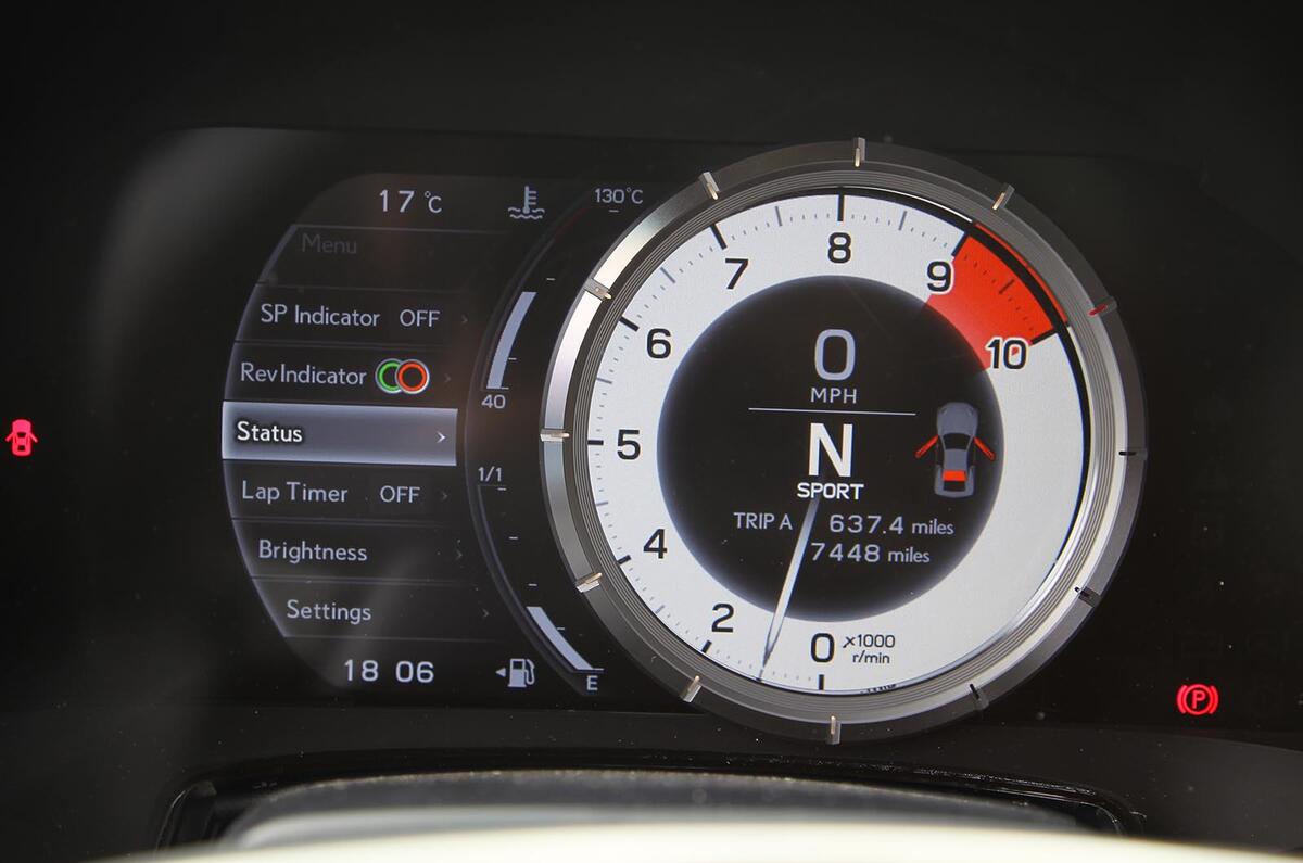
Todays best interiors i can think of are the Lexus LS and LC

abkq 14 August 2020

The biggest failing in

The biggest failing in contemporary car design is perhaps the interior.

Compare, for example, the interior of Focus 1 with that of the latest generation. The older car looks like something from the Design Museum, the latest from Woolworths.

Audi's interiors have gone from Bauhaus to the decorative Baroque.

Mercedes has the most vulgar digital instrument graphics.

Jaguar & Aston Martin seem to treat their interiors as an irrelevant afterthought.

The typical Ferrari dashboard is a cacophony of unrelated shapes.

Even though DS as a brand doesn't make much sense, it's DS's interior design that points the way forward to something more inventive and tasteful.