Currently reading: Vauxhall design chief Mark Adams on the new Insignia Grand Sport

We catch up with Vauxhall's design chief to chat about the all-new, high-quality look and more upmarket Insignia Grand Sport

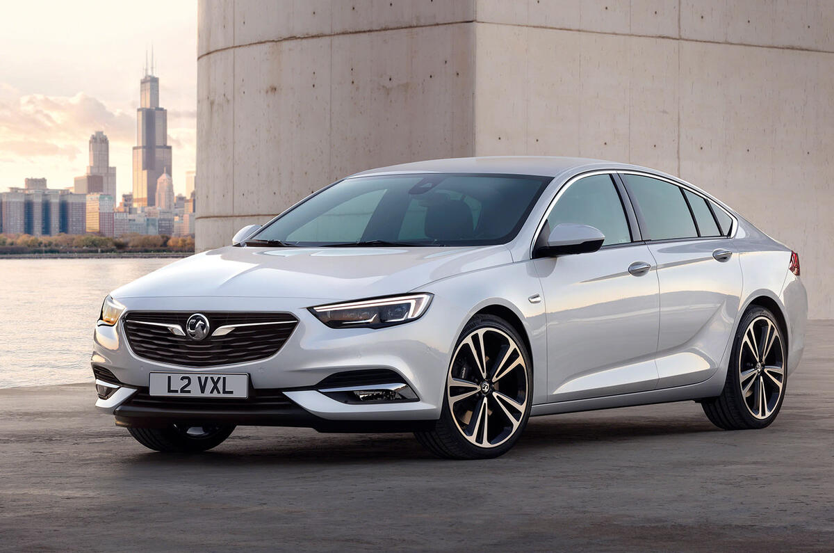
The 2017 Vauxhall Insignia Grand Sport has been revealed, so we've caught up with Vauxhall's design chief Mark Adams, to learn about how he created the "premium aura" of the firm's new flagship model.

Where do you start to design the follow-up to a flagship model?

“We want to create a vehicle that definitely has a premium aura, even if it is a value proposition. We wanted a car that would make people almost start to question their judgement in a way. If they can get a car that looks so good and offers so much value, why would you think about going up other than for reasons of brand snobbery?”

What did you want to improve?
Vauxhall insignia news web2016 1421 0

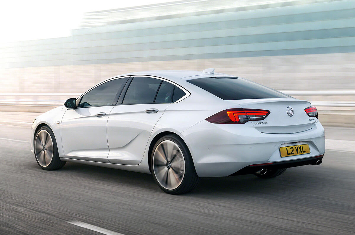
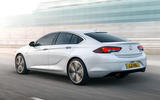
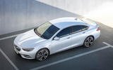
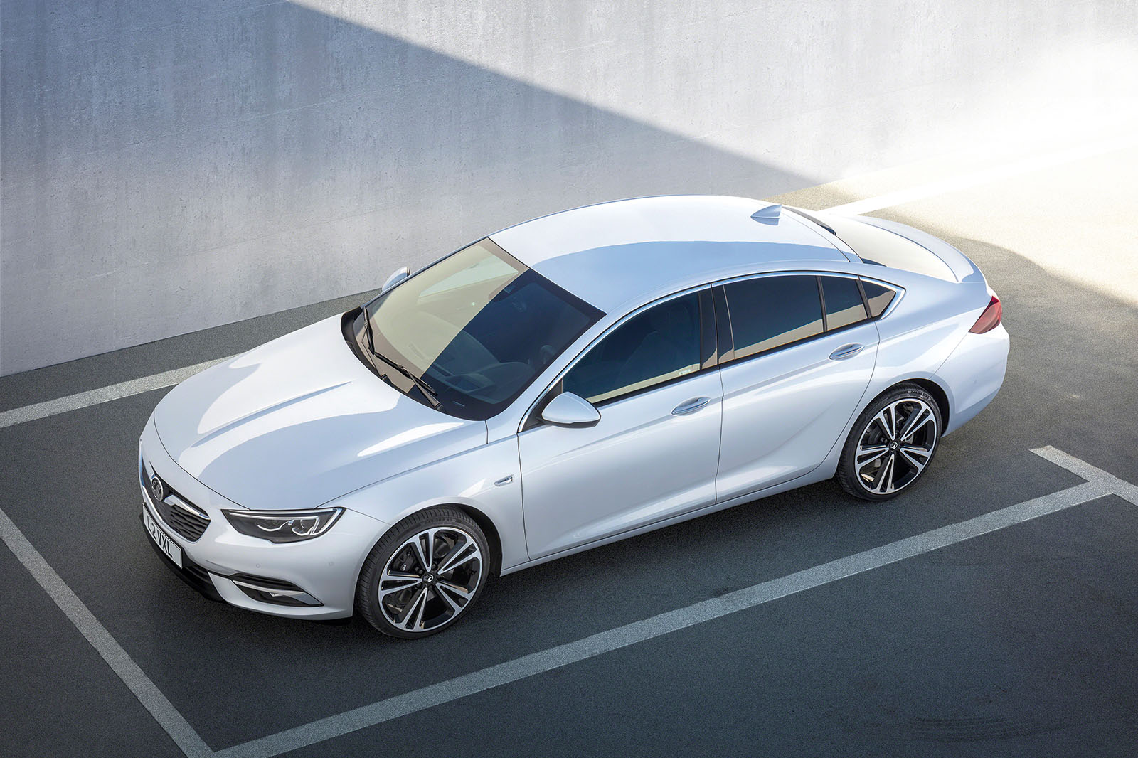
“We wanted the car to look much longer, lower and wider. But at the same time, we wanted to correct one of the slight negatives on today’s car, which was the rear seat package. We’ve got more leg, head and shoulder room, so it feels much bigger, yet when you look from the outside, the car looks even more coupé-ish.”

Is the Insignia Grand Sport’s design inspired by the Monza concept?

“Yes, absolutely. The clay model of the Monza was finished about a year or so [in 2012] before we showed the actual car at the motor show and I made sure that that model was sitting in the middle of the production studio. In fact, I said to all of my team that I wanted that car to influence everything we’re doing. The Insignia was in the early stages of development then.”

What have you tried to improve inside?

Vauxhall insignia news web2016 1416 0

Back to top

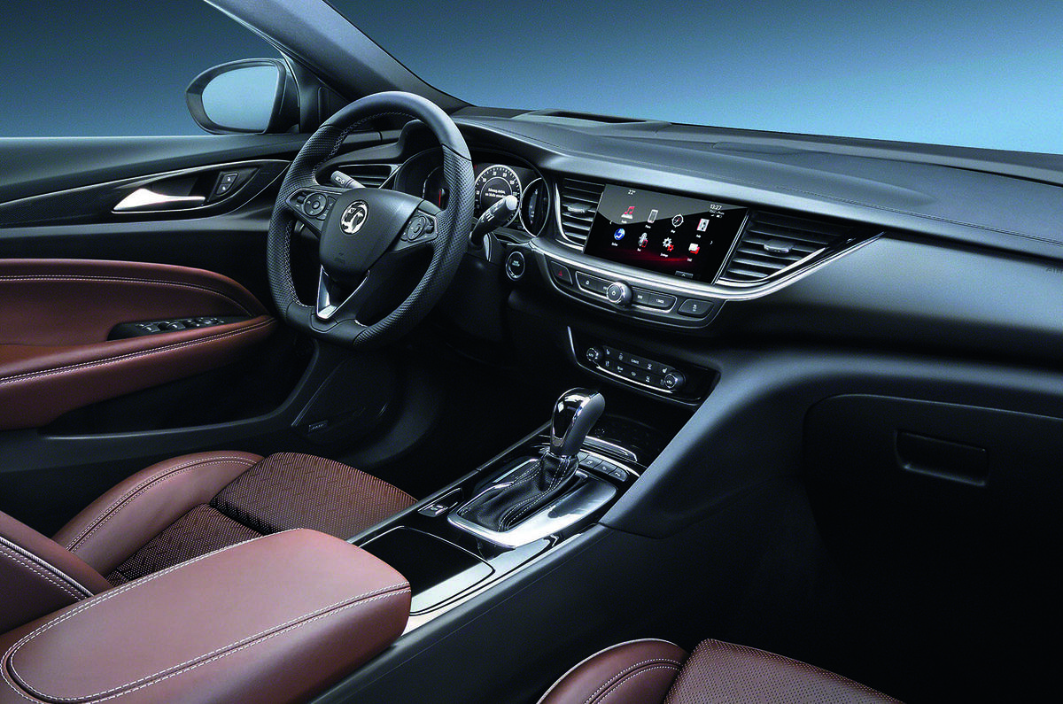
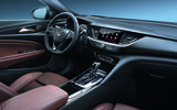
“I’d say there are three major elements that we tried to optimise for the interior: the overall shape, the use of materials and the HMI/ infotainment experience.”

The E2 architecture that underpins the car… what advantages does that bring for design?

“We worked in the early stage with engineering to find a balanced set of attributes that would work for us when we did the final design. So the moving around of the wheelbase and the packaging optimisation were done hand in hand with us right from the beginning, before we even had the final design in mind.”

In a conservative segment, is it hard to come up with something so vivid?

“I think that’s what we’re trying to do with the brand as a whole. If I look back at the distant history of Vauxhall, there were some really great cars but then there were some also-rans. I think we’ve been very inconsistent as a brand in the past, so some of the things I’ve been working on with my team very hard for the past few years is really driving much more consistency.”

Read more:

2017 Vauxhall Insignia Grand Sport officially revealed

Can the 2017 Vauxhall Insignia Grand Sport steal sales from premium players?

Join the debate

Comments
3
Add a comment…
JRL 7 December 2016

Looks Good

I doubt this will be stealing a great number of sales from BMW/Merc/Audi, most people buy those cars because they have a badge on the front. Vauxhall, in recent years, have produced a steady stream of decent, honest, good looking vehicles that tick 99% of many drivers boxes. The 1% missing is the premium badge, but there is nothing they can do about that.

I genuinely think this is a great piece of kit, and if it drives as well as it looks, much like the Astra, it could be heading straight to the top of the class.

spanco 6 December 2016

And I really like the way the

And I really like the way the touchscreen is integrated into the dashboard architecture, unlike the cheap and aftermarket looking efforts of Mercedes, Audi and BMW who plonk screens on the top of their dashboards like they couldn't have been bothered to style it properly in the first place.
WallMeerkat 7 December 2016

spanco wrote:

spanco wrote:

And I really like the way the touchscreen is integrated into the dashboard architecture, unlike the cheap and aftermarket looking efforts of Mercedes, Audi and BMW who plonk screens on the top of their dashboards like they couldn't have been bothered to style it properly in the first place.

Good point Spanco, when I first got into a colleagues 3 series I thought the screen was some optional extra that maybe rose out of the dashboard.

No, it just sits there like some cheap aftermarket tablet/satnav on a dashboard holder. Really jarring against the rest of the interior.

I guessed this was so they could sell base model 'fleet specials' without the screen, yet still use the same dashboard mouldings across the range.