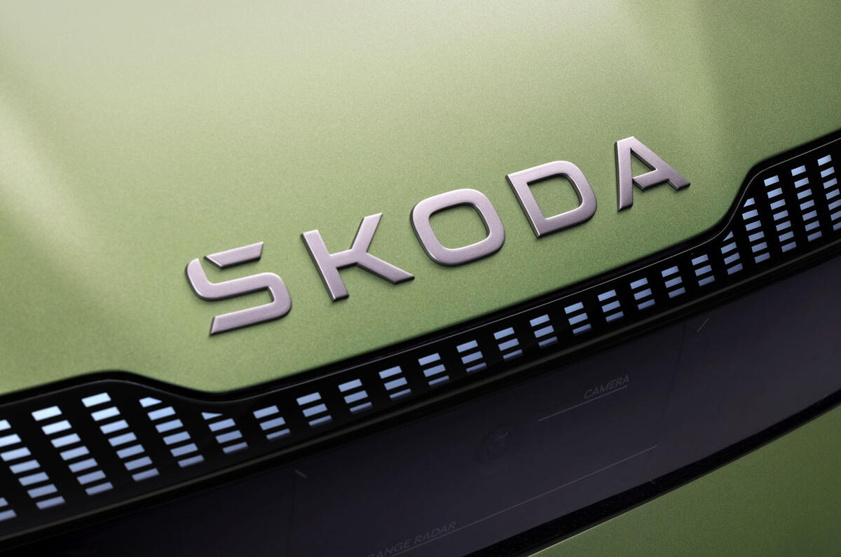
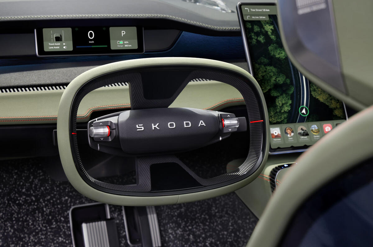
The next generation of Skoda vehicles won't be adorned by an emblem, the firm has confirmed, with just a new wordmark used instead.
Unveiling its fresh logo – the eighth iteration – alongside its new Modern Solid design language, the Czech firm confirmed that two versions have been created: an updated take on its classic emblem and a wordmark.
The historic emblem, which will only be used for communication and digital purposes, swaps the 3D design for a 2D effect, like parent brand Volkswagen did in 2019.
Like the Volkswagen logo, it's simpler and cleaner than the previous design so that it looks better digitally.

The word-only version has been created by the marque to be placed on its future cars.
This will be rolled out across the range from 2024, with new Skoda Superb and Skoda Kodiaq models, both to be announced next year, expected to be the first to wear it, followed by a refreshed Skoda Octavia.
It will also don the confirmed electric seven-seat SUV, supermini and compact crossover, which are all set to arrive before 2026. These will be the first cars to release with Skoda’s new design language, too.
Skoda says the changes are the biggest for the company in 30 years.
Describing the new logo, sales and marketing boss Martin Jahn said: “We see this as the perfect opportunity to make our brand fit for the decade of transformation.”
For the wordmark, designers have incorporated the caron accent that usually sits above the ‘S’ – which it describes as key to its Czech roots – within the letter. The firm wanted to keep the accent while removing the confusion that it believed it created among non-Czech-speaking customers.
The new emblem features two different shades of green, named Emerald and Electric, which Skoda says represent ecology, sustainability and electromobility.


Join the debate
Add your comment
❤️Hi) My name is Paula and I'm 23 years old) I'm an aspiring sex model) Please rate my photos at ➤ Ja.cat/id373088
Logos must be important considerations among marketing departments judging by the money spent tinkering with them. I doubt whether the average car buyer even notices these things.
But then in an age of look alike products, I suppose the badge becomes the all important brand identity.
So Skodo will become koda lol or oda lol or Skod or Sko.
I really think they should rethink this.